In today’s fast-paced digital world, managing multiple websites efficiently has become a critical skill for developers, freelancers, and businesses alike. As the number of websites grows, so does the complexity of monitoring updates, plugins, backups, and client interactions. The need for a streamlined, intuitive interface is no longer a luxury—it is a necessity. Modern web management platforms are stepping up, blending aesthetics, accessibility, and functionality to create dashboards that feel effortless, even under a heavy workload.
Over the past few years, the expectations of web administrators have shifted dramatically. Users no longer tolerate clunky interfaces or overwhelming color schemes. Instead, they crave dashboards that reduce cognitive load, enhance readability, and maintain consistency with familiar tools like WordPress or Slack. This evolution is driven not only by technology but also by the increasing understanding of user experience (UX) and accessibility standards.
The Rise of Dashboard-Centric Management
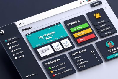
Web management dashboards act as the central nervous system for site administrators. They consolidate crucial data—from plugin updates to website analytics—and present it in a digestible format. However, with dozens of websites to manage, even small inefficiencies can lead to errors or wasted time. The pressure to improve usability has prompted companies to rethink dashboard design from the ground up.
A modern dashboard must balance three primary goals: clarity, familiarity, and efficiency. Clarity ensures that important information is immediately visible. Familiarity allows users to leverage their existing knowledge of tools and navigation patterns. Efficiency guarantees that repetitive tasks, such as checking plugin updates or monitoring backups, can be completed with minimal friction.
Familiar Patterns: Why Consistency Matters
One of the most overlooked aspects of dashboard design is visual consistency. When users switch between multiple platforms throughout their day—say WordPress, Slack, and a web management tool—the mental shift required to adjust to new color schemes, layouts, and visual cues can be exhausting. This phenomenon is called cognitive load, and reducing it is essential for productivity.
Dark sidebars and light work areas, for example, have become a standard pattern in WordPress admin interfaces. By mirroring this pattern, web management dashboards create a sense of familiarity. Users don’t need to relearn navigation or search for menu items; their existing muscle memory does most of the work. This approach is especially important for professionals who manage dozens of sites simultaneously, as it reduces mental fatigue and increases focus on meaningful work.
Moreover, consistent themes across all UI elements—buttons, dropdowns, notifications, and hover states—reinforce a sense of cohesion. It’s not just about aesthetics; it’s about creating an environment where the user feels in control and confident, no matter how complex the workload becomes.
The Importance of Visual Accessibility
Accessibility is no longer optional; it is a critical component of modern design. Dashboards must be readable, intuitive, and navigable for users with varying visual abilities. Poor contrast, muted colors, and small fonts can lead to missed alerts, overlooked notifications, and user frustration.
Recent design updates in web management dashboards prioritize accessibility by adhering to standards such as WCAG 2.2, ensuring that color contrast is sufficient for readability. For instance, tag colors, alerts, and status indicators are optimized to be distinguishable even for users with color vision deficiencies. This focus on visual clarity benefits all users, reducing eye strain and improving long-term usability.
Accessibility improvements are not limited to visual elements. Interactive components, such as buttons, dropdowns, and notifications, are refined to enhance keyboard navigation and screen reader compatibility. These enhancements collectively create a more inclusive and efficient dashboard experience.
Small Refinements, Big Impact
While major design overhauls attract attention, the subtle refinements often have the most profound effect on user experience. Features such as smoother hover states, improved spacing, and streamlined transitions contribute to a dashboard that feels responsive and polished.
Noise reduction is another critical factor. By removing unnecessary color variations and minimizing visual clutter, dashboards allow users to focus on what truly matters. This principle is akin to decluttering a workspace; fewer distractions mean more productivity.
Even the smallest details, like the placement of notification icons or the design of checkboxes, can significantly influence usability. A dashboard that anticipates user needs and subtly guides interactions can transform a routine task into a seamless workflow.
Early Access Programs: Shaping the Future of UX
Many web management platforms have adopted early access programs to test new features and gather user feedback before a public release. This approach has multiple benefits:
-
User-Centered Development: Developers receive real-world feedback from active users, allowing them to prioritize improvements that matter most.
-
Iterative Refinement: Early access enables gradual updates, reducing the risk of introducing disruptive changes.
-
Community Engagement: Users feel invested in the product’s evolution, creating a sense of ownership and loyalty.
Through early access, dashboards evolve in a way that balances technical innovation with human usability, ensuring that changes are meaningful rather than cosmetic.
Balancing Innovation and Familiarity
Introducing new features while maintaining familiarity is a delicate balance. Users expect dashboards to improve over time, but radical changes to layout or navigation can lead to confusion. By focusing on incremental updates, platforms can modernize the interface without alienating experienced users.
For example, updating color schemes to improve accessibility does not require changing the core navigation structure. Similarly, introducing interactive elements like collapsible menus or enhanced notifications can improve efficiency without disrupting the workflow. The key is to prioritize user comfort while integrating modern UX practices.
Multimodal Integration: The Next Frontier
Web management dashboards are beginning to incorporate multimodal elements, integrating text, visual cues, and real-time analytics into a single interface. This approach allows users to interact with data more intuitively, uncover patterns faster, and make informed decisions.
For instance, a dashboard may combine plugin update alerts with visual trend graphs and color-coded severity indicators. This multimodal presentation reduces cognitive load and enables administrators to prioritize tasks effectively. By providing information in multiple formats, dashboards cater to diverse user preferences and enhance overall efficiency.
Real-World Benefits for Professionals
The impact of an optimized dashboard extends beyond aesthetics; it directly affects productivity, error rates, and decision-making. Professionals managing multiple websites report:
-
Faster task completion: Streamlined navigation and improved alerts reduce time spent monitoring updates and troubleshooting issues.
-
Fewer errors: Clear visual cues and accessible design minimize the risk of overlooking critical notifications.
-
Improved focus: Reduced cognitive load allows users to concentrate on strategic tasks rather than micromanaging routine updates.
-
Enhanced satisfaction: A polished, familiar interface contributes to a positive user experience, fostering engagement and loyalty.
These benefits are particularly significant for agencies and freelancers handling dozens or hundreds of client websites. In such environments, even small efficiencies can translate into substantial time and cost savings.
Accessibility as a Competitive Advantage
As the web becomes more accessible, platforms that prioritize usability and inclusivity gain a competitive edge. Companies that ignore accessibility risk alienating users and missing out on potential markets. By integrating accessible design from the outset, dashboards not only comply with legal standards but also demonstrate a commitment to user-centric development.
Accessibility improvements are also linked to employee well-being. Reducing eye strain, minimizing fatigue, and providing intuitive interactions contribute to a healthier work environment. In the long term, this translates into higher productivity, reduced errors, and increased user satisfaction.
Feedback Loops and Continuous Improvement
The success of modern dashboards relies on continuous improvement, fueled by user feedback. Early access programs, surveys, and usability testing provide developers with actionable insights. By analyzing patterns in user behavior, platforms can identify pain points, refine features, and prioritize updates that deliver the most value.
Feedback loops also promote transparency and trust. Users understand that their input influences the product’s evolution, creating a collaborative development environment. This approach aligns with modern software development principles, emphasizing agile iteration, user-centered design, and data-driven decision-making.
Case Study: Transforming a Complex Workflow
Consider an agency managing 50 client websites. Before the UI update, administrators faced several challenges:
-
Difficulty distinguishing alerts due to low contrast
-
Confusing navigation leading to wasted time
-
Visual clutter causing overlooked updates
After implementing a redesigned dashboard with a dark sidebar, high-contrast tags, and streamlined notifications, the agency observed:
-
30% faster plugin update management
-
50% reduction in missed alerts
-
Enhanced team satisfaction and reduced cognitive fatigue
This case illustrates that thoughtful design changes, even when incremental, have measurable benefits in real-world workflows.
Preparing for the Future of Web Management
As digital ecosystems evolve, dashboards must anticipate emerging needs. Features like integrated security alerts, AI-driven recommendations, and automated reporting are becoming essential. Modern dashboards act as centralized hubs, combining management, monitoring, and analytics into a cohesive experience.
Future updates are likely to incorporate:
-
Predictive maintenance alerts powered by machine learning
-
Multimodal analytics integrating visual, textual, and audio data
-
Customizable dashboards tailored to user roles and preferences
-
Enhanced accessibility features for global audiences
By continuously evolving, dashboards not only meet current user needs but also prepare for the challenges of tomorrow.
The evolution of web management dashboards demonstrates that design is more than decoration; it is a strategic enabler of productivity, accuracy, and user satisfaction. By focusing on clarity, familiarity, accessibility, and continuous improvement, modern dashboards transform complex workflows into intuitive experiences.
For professionals managing multiple websites, these improvements are not minor—they are transformative. A well-designed dashboard reduces errors, minimizes fatigue, and allows administrators to focus on what truly matters: delivering value to clients, optimizing performance, and innovating in their digital workspaces.
The future of web management is here, and it is user-centered, accessible, and visually intuitive. Those who embrace these principles will not only work more efficiently but also set new standards for excellence in digital operations.
FAQ: Revolutionizing Web Management Dashboards
Q1: What is a web management dashboard?
A web management dashboard is a centralized platform that allows administrators, freelancers, and agencies to monitor and manage multiple websites from a single interface. It provides access to plugin updates, backups, analytics, client management, and other critical site functions.
Q2: Why is dashboard usability important?
Usability reduces cognitive load, minimizes errors, and improves productivity. A well-designed dashboard allows users to quickly access essential information, make informed decisions, and perform tasks efficiently without confusion or fatigue.
Q3: What makes a dashboard visually accessible?
Visual accessibility includes high-contrast colors, readable fonts, clear labels, and intuitive navigation. It ensures that all users, including those with visual impairments, can easily interpret alerts, tags, and status indicators without straining their eyes.
Q4: How does consistency improve user experience?
Consistency in layout, colors, and navigation patterns leverages familiar workflows, reduces the learning curve, and allows users to rely on muscle memory. When dashboards align with widely-used tools like WordPress or Slack, users adapt faster and work more efficiently.
Q5: What are some small refinements that enhance dashboards?
Small refinements include smoother hover states, optimized spacing, streamlined color palettes, and subtle transitions. While these may seem minor individually, together they create a polished and comfortable user experience.
Q6: What is an early access program in web management tools?
Early access programs allow users to test new features before public release. Participants provide feedback, enabling developers to prioritize updates, fix issues, and refine usability. It fosters a collaborative development process.
Q7: How do dashboards improve productivity for agencies managing multiple websites?
By consolidating essential data, reducing visual clutter, and highlighting important alerts, dashboards allow administrators to quickly identify issues, perform updates, and manage client sites more efficiently. This saves time and reduces errors.
Q8: What role does accessibility play in user satisfaction?
Accessible design reduces eye strain, cognitive fatigue, and frustration. Users can focus on meaningful work rather than struggling with difficult-to-read interfaces. This leads to higher satisfaction, better performance, and reduced errors.
Q9: What is multimodal dashboard design?
Multimodal dashboards present data in multiple formats, such as graphs, alerts, color-coded tags, and text summaries. This approach allows users to absorb information faster, identify patterns more easily, and interact with data more intuitively.
Q10: How are future dashboards evolving?
Future dashboards will integrate AI-powered recommendations, predictive alerts, automated reporting, and customizable layouts. They aim to anticipate user needs, optimize workflows, and provide a unified interface for managing websites, security, analytics, and client interactions.
Q11: Are dashboard updates disruptive to existing workflows?
Not if they are designed with familiarity in mind. Modern updates focus on incremental improvements, keeping core navigation and layouts consistent while enhancing usability, contrast, and accessibility.
Q12: Can these dashboards help prevent mistakes in website management?
Yes. Clear visual alerts, high-contrast notifications, and well-organized information help administrators detect problems quickly, reducing the risk of missed updates or mismanaged client websites.